Short Summary
Good design is invisible. Its goal is to guide users effortlessly to the right action at the right time. Bad design, on the other hand, screams out its inadequacies, making itself very noticeable.
Over time, the tools and objects in the world will change, cultures will change, technologies will change, but the principles of design will hold. This is because the principles of design, based on human psychology, will always remain the same.
Favorite Quote
"Good design is actually a lot harder to notice than poor design, in part because good designs fit our needs so well that the design is invisible."
―Don Norman
Book Notes
The Psychopathology of Everyday Things
The two most important characteristics of good design are Discoverability and Understanding. Discoverability asks what actions are possible of the product and where and how to perform them. Understanding asks how the product is supposed to be used.
Design is concerned with how things work, how they're controlled, and the nature of the interaction between people and technology. When done well, the results are brilliant, pleasurable products.
But when done poorly, it can lead to frustration and irritation. Bad design of more complex commercial and industrial products and machines can even lead to accidents, injuries, and death.
When accidents happen, often, the operators are the ones blamed for not understanding the machine. But the situation should be reversed. It's the duty of machines and those who designed them to understand people, not the other way around.
The solution is Human-Centered Design (HCD) which puts human needs, capabilities, and behavior first. It starts with an understanding of psychology and technology. Good design requires good communication between machine and person, indicating what actions are possible, what is happening, and what is about to happen.
When we interact with a product, we need to figure out what it does, how it works, and what operations are possible. The discoverability of a product is determined by a combination of six fundamental design concepts:
- Affordances
- Signifiers
- Constraints
- Mappings
- Feedback
- Conceptual Models
Affordances: The relationship between a physical object and a person (or any interacting agent) that determines how the object could be used. Affordances are the possible interactions between people and the environment. They can be either perceivable or invisible. For example, a chair can afford support, and, therefore, is used for sitting.

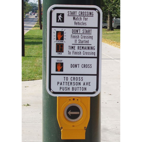
Signifiers: The signals that communicate where the action should take place. They can be signs, labels, and drawings placed in the world to indicate what particular actions are possible and how they should be done. They must be perceivable; else, they fail to function.
Signifiers are more important than affordances since they communicate to the user how to use the design. For example, a common signifier would be a sign labeled "push," "pull," or "exit" posted on or above public doors.

Constraints: Powerful clues, limiting the set of possible actions, even in a novel situation. They can be physical, logical, semantic, and cultural as long as they guide action and ease interpretation.
The world has many natural, physical constraints that restrict the possible behavior: such things as the order in which parts can go together and how the object can be moved, picked up, or manipulated.

Mappings: The relationship between the elements of two sets of things. It is an important concept in the design and layout of controls and displays.
A control is easiest to learn wherever there is an understandable mapping between the controls, actions, and the intended result. Natural mappings take advantage of spatial analogies: moving an object up would be achieved by moving the control up.
An excellent example is the seat controls in a Mercedes-Benz. The controls are shaped like the seat. Moving the seat forward is done by pressing the seat control forward.

Feedback: A way of communicating the results of an action on time. If the delay is too long, people will often give up and do something else. Feedback must also be informative and planned.
Poor feedback can be worse than no feedback at all because it is distracting, uninformative, and in many cases, irritating and anxiety-provoking. A simple flashing light or auditory beep is usually more annoying than useful.
Conceptual Models: Perhaps the most important design concept, a conceptual model is an explanation, usually highly simplified, of how something works. It doesn't have to be complete or even accurate as long as it is useful.
Good communication that enhances both discoverability and understanding is the key to good conceptual models. The files, folders, and icons you see on your computer screen are good conceptual models even though they aren't accurate.

The Psychology of Everyday Actions
When people use something, they face two gulfs: the Gulf of Execution, where they try to figure out how it operates, and the Gulf of Evaluation, where they try to figure out what happened. The role of the designer is to help people bridge the two gulfs.
The Gulf of Execution is bridged through the use of signifiers, constraints, mappings, and a conceptual model. These can be physical elements such as handles, knobs, and buttons.
The Gulf of Evaluation reflects how much effort a person must make to interpret the state of the device and determine if expectations and intentions have been met. This is done through the use of feedback and a conceptual model.
A useful framework for developing new products or services is the seven-stage action cycle. The first stage, the goal, is what the user would like to have done. The next three stages are concerned with execution, followed by three stages of evaluation.
The Seven Stages of Action:
- Goal (What do I want to accomplish?)
- Plan (What are the alternative action sequences?)
- Specify (What action can I do now?)
- Perform (How do I do it?)
- Perceive (What happened?)
- Interpret (What does it mean?)
- Compare (Is this okay? Have I accomplished my goal?)
Anyone using a product should always be able to determine the answers to all seven questions. The information that helps answer the questions of execution is feedforward (knowing what you can do), while the information that aids in evaluation is feedback.
Knowledge in the Head and in the World
Every day we are confronted by numerous objects, devices, and services, each of which requires us to behave or act in some particular manner. Overall, we manage quite well, even when our knowledge is incomplete, ambiguous, or wrong. We manage because we combine the knowledge in our heads with knowledge in the world.
Much of the knowledge a person needs to do a task can be derived from information in the world. For example, we lack the knowledge of common coins, even though we easily recognize them. We know what currency looks like, but we don't know all the details—only enough to distinguish one value from another.

We have limited knowledge because we only need to remember enough to accomplish our tasks. Because so much knowledge is available in the environment, it's surprising how little we need to learn. This is one reason people can function well in their environment and still be unable to describe what they do.
Signifiers, physical constraints, and natural mappings are all perceivable cues that act as knowledge. They're used so often that they are often overlooked. Good design also mitigates the limitations of our short-term memory by using several techniques. One is through the use of multiple sensory modalities: sight, sound, touch (haptics), hearing, spatial location, and gestures.
Another technique is using rules and constraints to standardize things in the world. When things make sense, they correspond to the knowledge we already have so new material can be understood, interpreted, and integrated with ease.

For example, if you took apart a common appliance, such as a toaster, there would be tens of parts with a seemingly infinite number of ways to reassemble them. But few configurations are possible because the pieces have been designed to not fit into spots reserved for others.
Knowledge in the world is a valuable tool for remembering, but only in the right place at the right time. Combined with knowledge in our head, it creates an effective memory that allows us to function quite well in the world, even though our source of knowledge is insufficient.
Knowing What to Do: Constraints, Discoverability, and Feedback
How can designers provide critical information that allows people to know what to do, even when experiencing an unfamiliar device or situation? They have no choice but to combine knowledge in the world with what's in the user's head by using constraints, discoverability, and feedback.
There are four classes of constraints appearing in a wide variety of situations: physical, cultural, semantic, and logical.
Physical Constraints: They rely upon properties of the physical world for their operation; no specialized training required. Physical constraints are made more effective and useful if they are easy to see and interpret, so the set of actions is restricted before anything has been done. A square peg cannot fit into a round hole.

A popular form of physical constraint is the forcing function. Forcing functions are used in situations where the failure at one stage prevents the next step from happening. Starting a car has a forcing function: the driver must insert the key in the ignition or have the key present to start the vehicle.
Cultural Constraints: Each culture has a set of allowable actions for social situations. Because there are no universally accepted conventions or customs for dealing with culture, we often have many problems with designing new machines. Cultural constraints, like culture, are likely to change over time.
Semantic Constraints: Constraints relying on the meaning of the situation to control the set of possible actions. They rely upon our knowledge of the situation and the world. Semantic constraints are also likely to change over time with the advent of new technologies.
Logical Constraints: Constraints which have a logical relationship between the spatial or functional layout of components and the things that they affect or are affected by. If two switches control two lights, the left switch should work the left light; the right switch, the right light.
Human Error? No, Bad Design
When an accident is thought to be caused by people, we tend to blame them for the error and continue doing things just as we always had. But that's the wrong approach. We should treat all failures in the same way: find the fundamental causes and redesign the system so they can no longer lead to problems.
Errors occur for many reasons. The most common is when tasks and procedures require people to behave in unnatural ways—staying alert for hours at a time, providing precise, accurate control specifications, multitasking, and being subjected to multiple interfering activities.
When an error happens, instead of blaming the operator, we should determine why it happened, then redesign the product or procedures being followed so it will never occur again. If the system lets you make the error, it is badly designed. And if the system induces you to make the error, then it is really poorly designed.
Two Types of Errors: Slips and Mistakes
Slips: A slip occurs when a person intends to do one action and ends up doing something else. The action performed is not the same as the action intended. There are two major classes of slips: action-based and memory lapse.
An action-based slip is when the wrong action is performed. A memory lapse is when memory fails, so the intended action isn't done.
Mistakes: A mistake occurs when the wrong goal is established or the wrong plan formed. The action performed matches the plan, but the plan is wrong. There are three major classes of mistakes: rule-based, knowledge-based, and memory-lapse.
A rule-based mistake is when a person follows the wrong rule. A knowledge-based mistake is when the problem is misdiagnosed because of erroneous or incomplete information. Memory-lapse mistakes occur when either the goal, plan, or evaluation is forgotten.
Mistakes often arise from ambiguous or unclear information about the current state of a system, the lack of a good conceptual model, or inappropriate procedures.
Given the mismatch between human competencies and technological requirements, errors are inevitable. Therefore, the best designs seek to minimize the opportunities for errors while also mitigating the consequences. Here are the key design principles for preventing errors:
- Put the knowledge required to operate the technology in the world.
- Use natural and artificial constraints and exploit the power of forcing functions and natural mappings. In the physical world, this can be done through the clever use of shape and size.
- Make things visible, both for execution and evaluation. Provide feedforward information: make the options readily available. Provide feedback: make the results of each action apparent.
Design Thinking
Good designers never start by trying to solve the problem given to them: they start by trying to understand what the real issues are. Two of the most powerful tools of design thinking are Human-Centered Design (HCD) and the Double-Diamond Model of Design.
Human-Centered Design: Concerned with solving the right problem while doing it in a way that meets human needs and capabilities. It is a procedure for addressing whether people's needs are met, if the product is understandable and usable, if it accomplishes the desired tasks, and if the experience is positive and enjoyable.
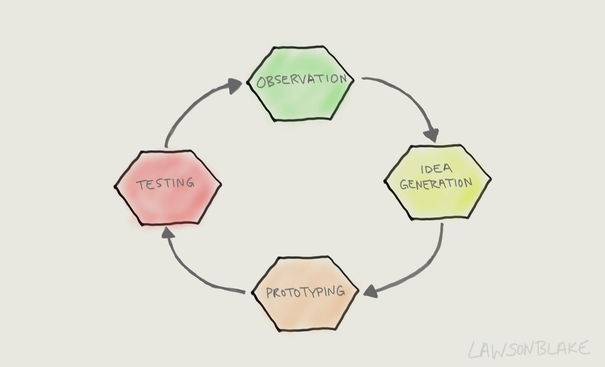
There are four different activities in the Human-Centered Design process:
- Observation: The initial research to understand the nature of the problem. It requires both design research and market research.
- Idea generation (ideation): The generation of numerous ideas while being creative without regard to constraints. You want to question everything, so all potential solutions are discovered.
- Prototyping: The only way to know if an idea will work is to test it. A quick prototype or mock-up will help check whether the problem is well understood.
- Testing: Gathering a small group of people who corresponds with your target market and have them use the prototype. Study how they use it and what questions arise to ensure the problem is well understood.
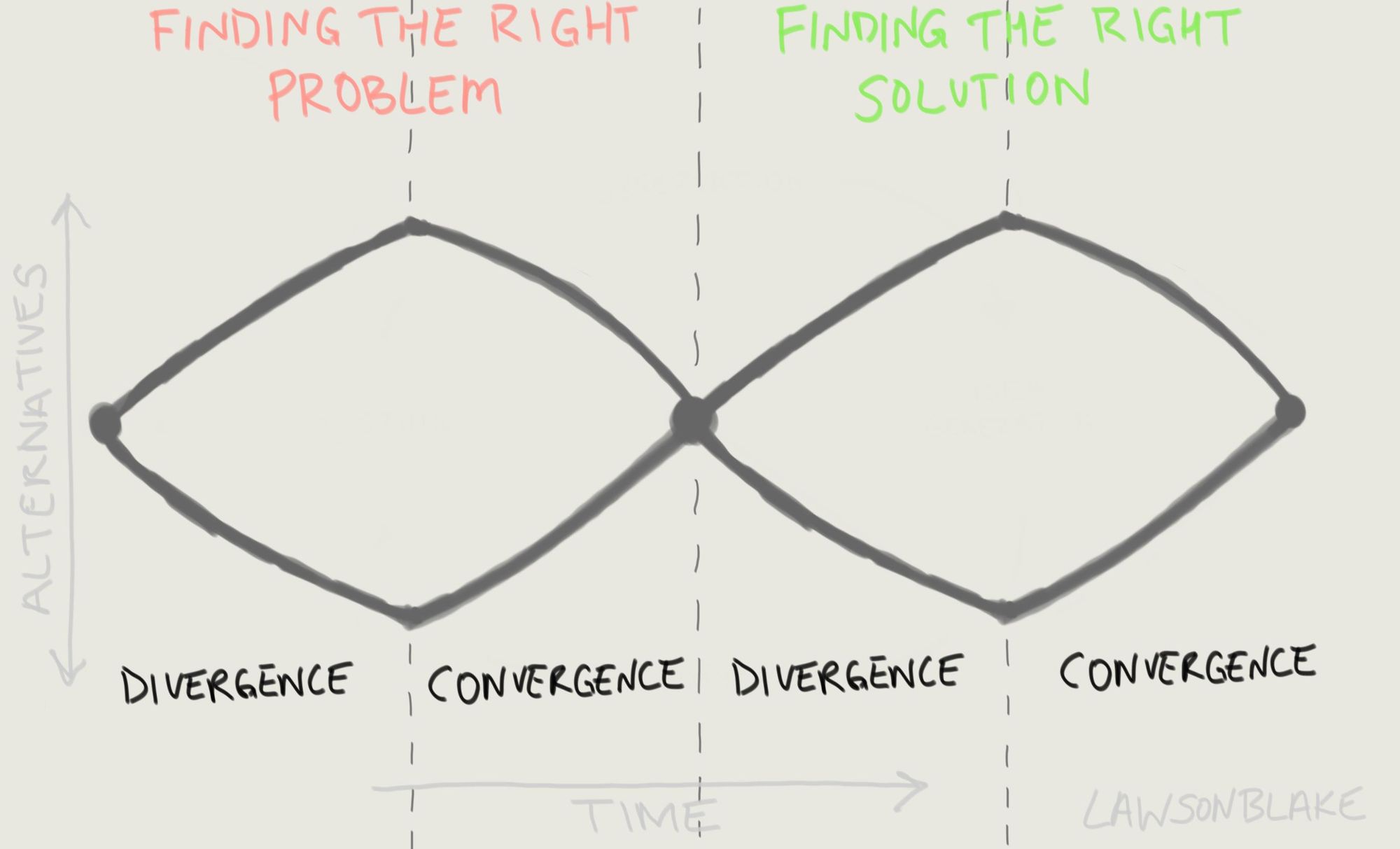
Double-Diamond Model: First introduced in 2005 by the British Design Council, it divides the design process into four stages: discover, define, develop, and deliver. The Double-Diamond Model describes the two phases of design: finding the right problem and fulfilling human needs.
Designers start by questioning the problem given to them. Then they expand the scope of the problem, diverging to examine all the fundamental issues that underlie it. Then they converge upon a single problem statement. During the solution phase, they expand the possible solutions, thus going back to the divergence phase. Finally, they converge upon a proposed solution.
Design is successful only if the final product is successful—if people buy it, use it, and enjoy it, thus spreading the word. A design people do not purchase is a failed design, regardless of how great the design team might consider it.
Therefore, designers need to satisfy people's needs, in terms of function, in terms of being understandable and usable, and in terms of their ability to deliver emotional satisfaction, pride, and delight. The design must be thought of as a total experience.
Design in the World of Business
Unfortunately, the principles of design cannot be followed inside of a vacuum. The realities of the world impose severe constraints upon the design of products. Such constraints include global competition, costs, and strict deadlines. Compromises often have to be made.
But competitive forces are also what drive innovation in a particular field or industry. The two forms of product innovation relevant to design are incremental innovation and radical innovation. The former follows a natural, slow evolutionary process; the latter is achieved through radical new development.
Incremental Innovation: Most design evolves through incremental innovation using continual testing and refinement. It starts with trying to make an existing product better. In the ideal case, the design is tested, retested, and modified.
Radical Innovation: Radical innovation starts fresh, often driven by new technologies, making new capabilities possible. Its what many people seek, the spectacular form of change, but most radical ideas fail. In general, people tend to think of innovation as radical changes, whereas the most common and powerful form is small and incremental.
With massive change, many fundamental design principles stay the same. Humans have always been social beings craving interaction and the ability to keep in touch with people across the world and across time. Even as machines become more autonomous, the fundamental principles guiding their interactions will remain constant.
Read More on Amazon:
Subscribe to Lawson Blake
Get the latest posts delivered right to your inbox
